Personal Logos
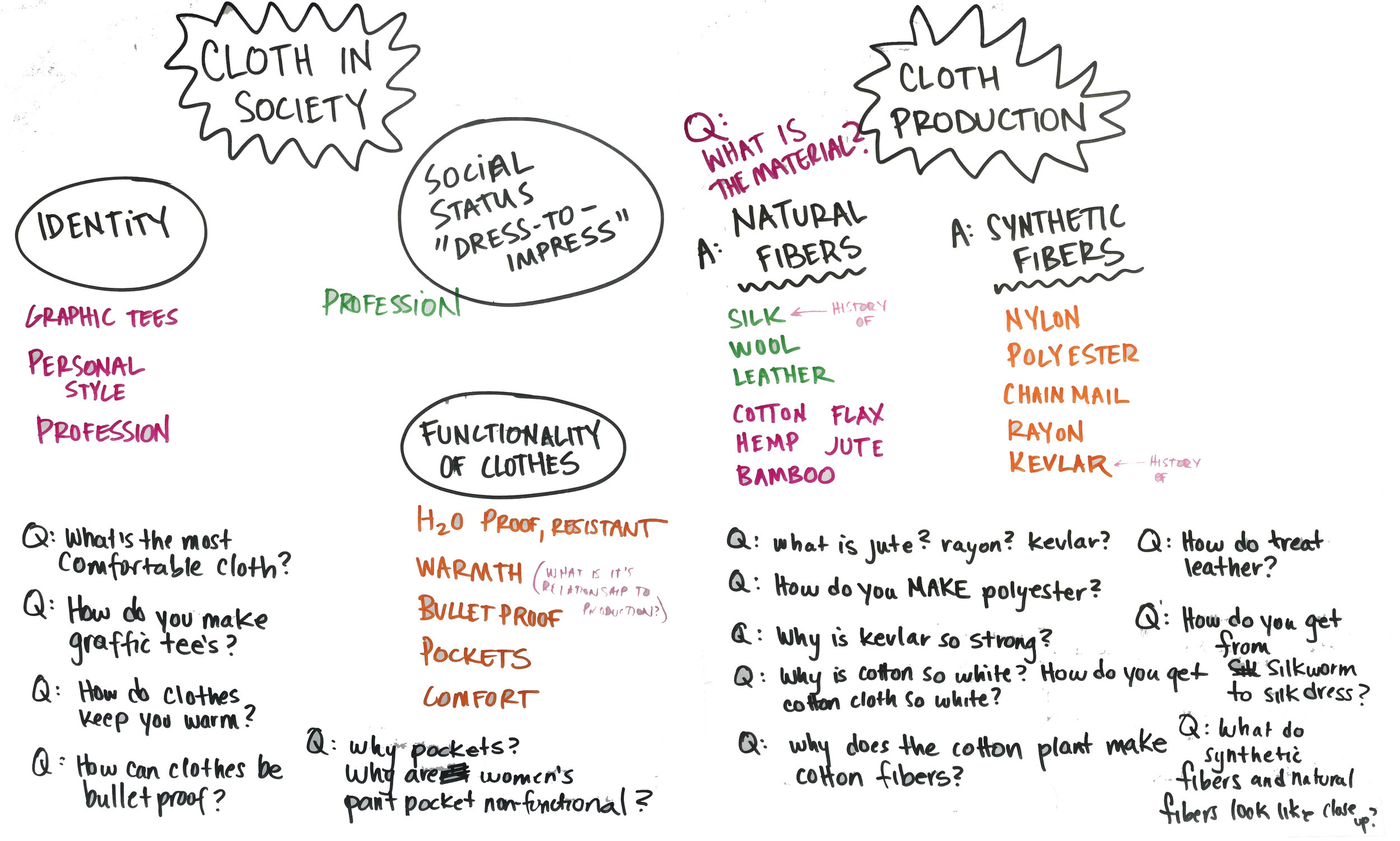 The Amber Band started the Cloth Arc with a brainstorming session, and we realized that we still had some lingering questions on identity from the Coin Arc. Questions around personal style and perception started popping up, which led us to question the materiality of cloth as well. We grouped our brainstorm into two main categories: Cloth in Society and Cloth Production. Starting with Cloth in Society gave us a chance to build off of the work we did around symbols of value.
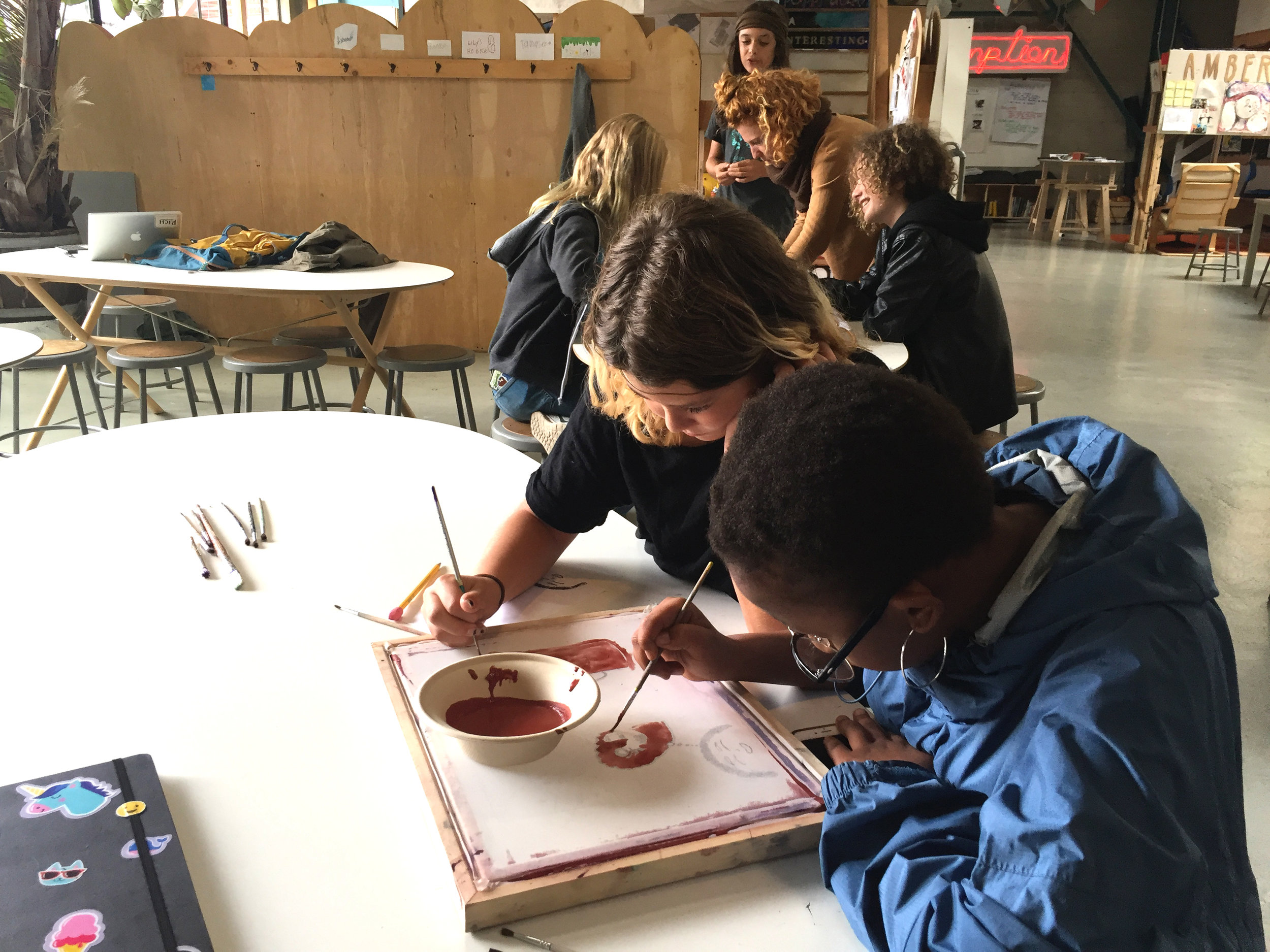
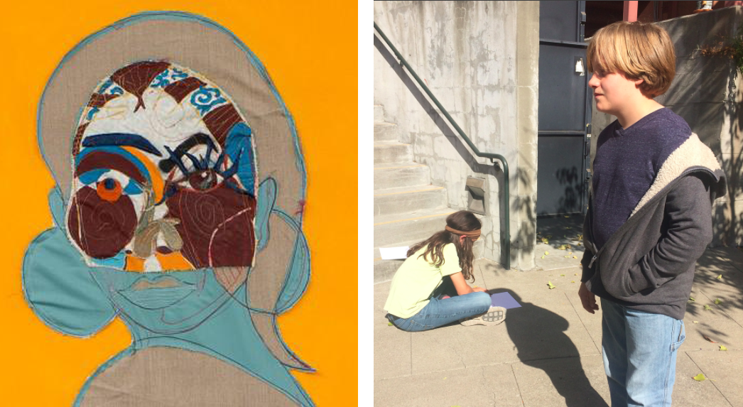 Contemporary artist Tschabalala Self provided some great resources on how to use color and shape as symbols for identity. We looked at her work in this episode of The Art Assignment from PBS, and worked on a first iteration for our personal logos. Students started with simple line drawings, tracing their shadows, and filling those lines with colors and patterns. They worked through several simple line drawings before choosing one to build off of for their second iterations using a screenprinting technique.
 While working on their personal logos students also chose a commercial logo to conduct a short research project on. They looked at the logo's origin story, where it came from, what it is referencing, and the iterations that it went through. Their research had them drawing on several sources and generating additional related, focused questions that got them thinking about the ways they chose to design their own personal logos.
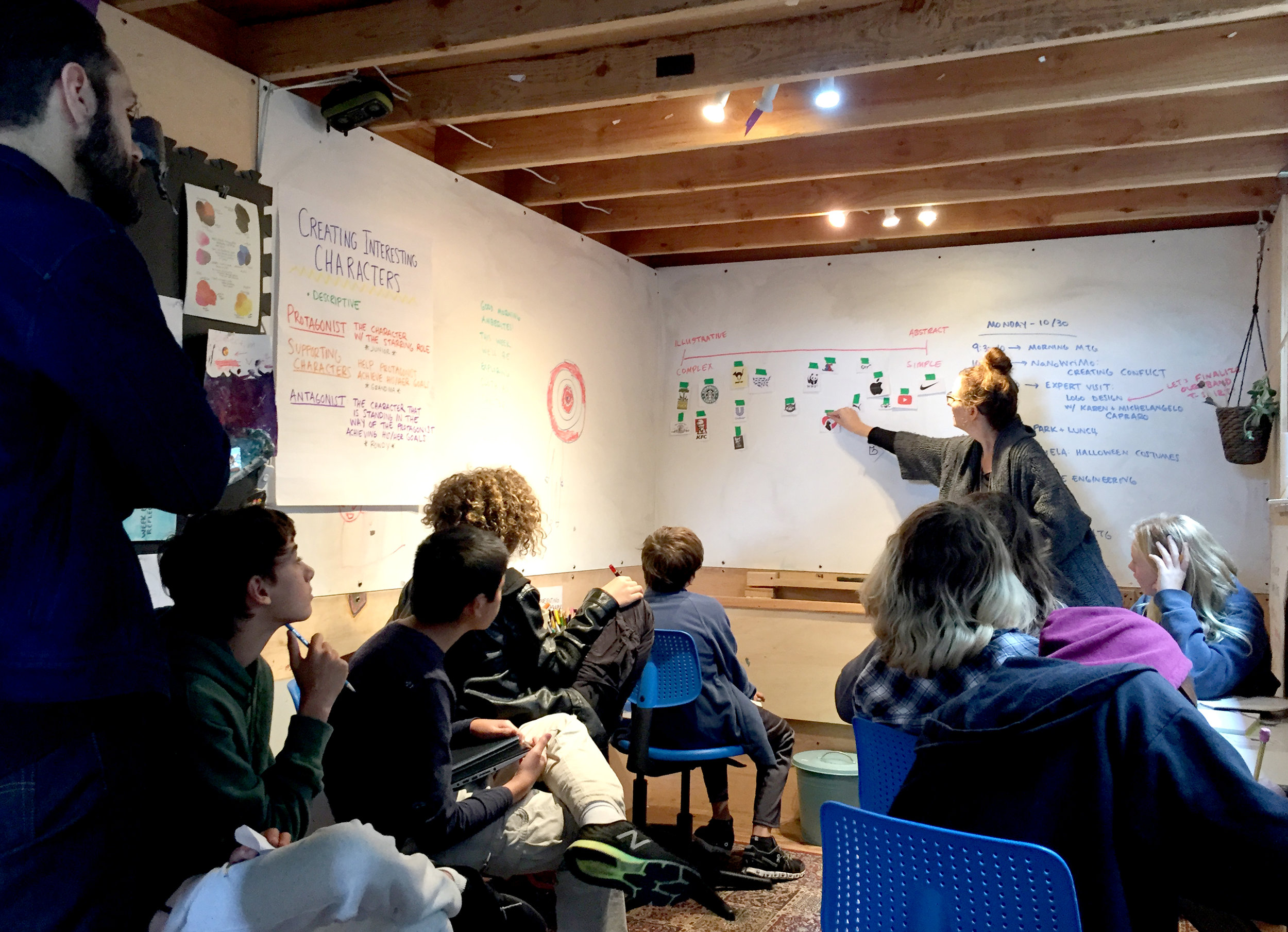
 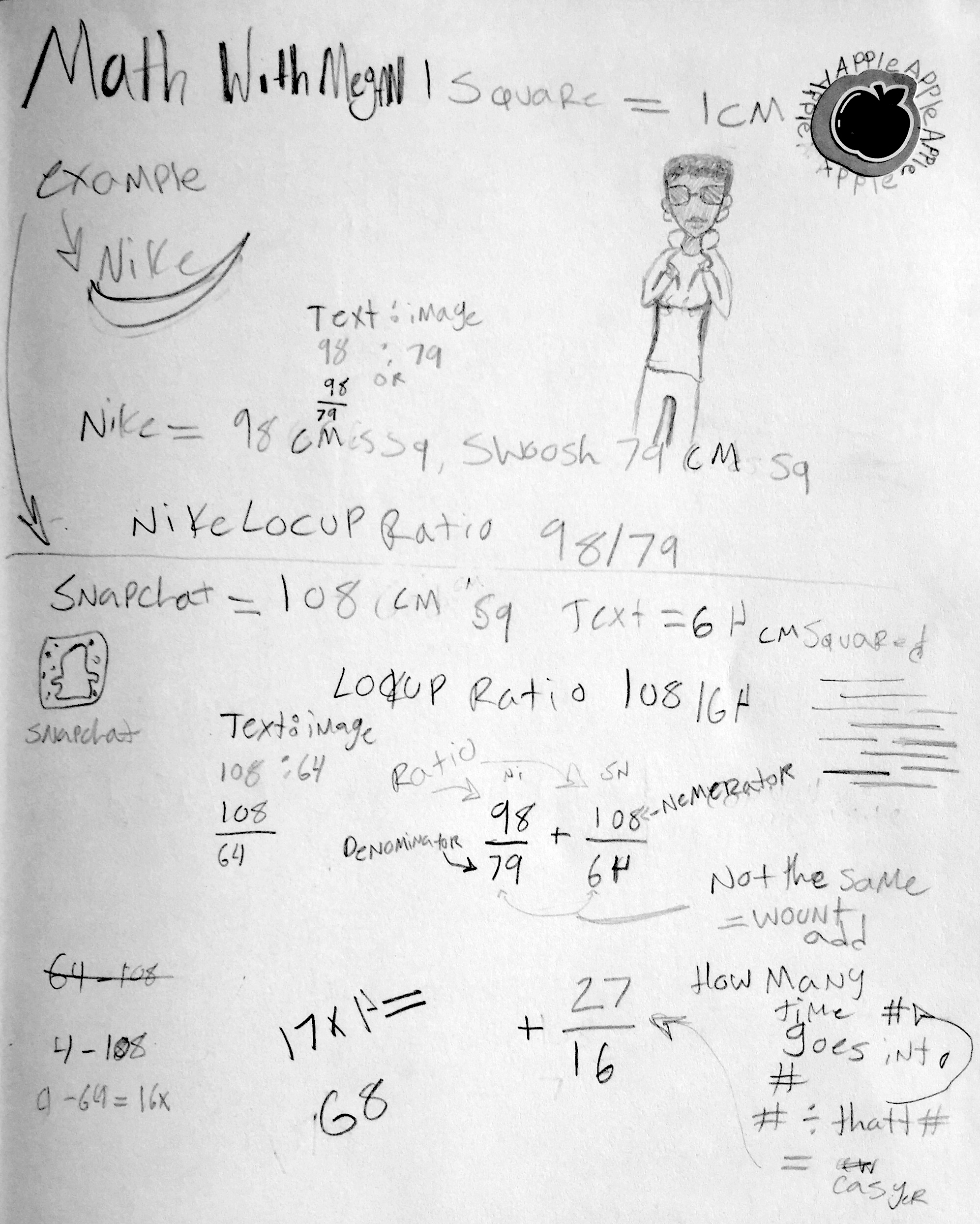 Looking at these commercial logos had us thinking about the math behind graphic design work. We learned about logo lockups, and how the final form of a logo includes a structure for all of its elements. Lockups work within a grid, and have a set ratio and proportion of elements to keep the composition balanced. This gridded structure gave us an opportunity to talk about fractions, ratios, and proportions. We measured and analyzed the ratio of image to text in logos from Nike, Target, and Snapchat.
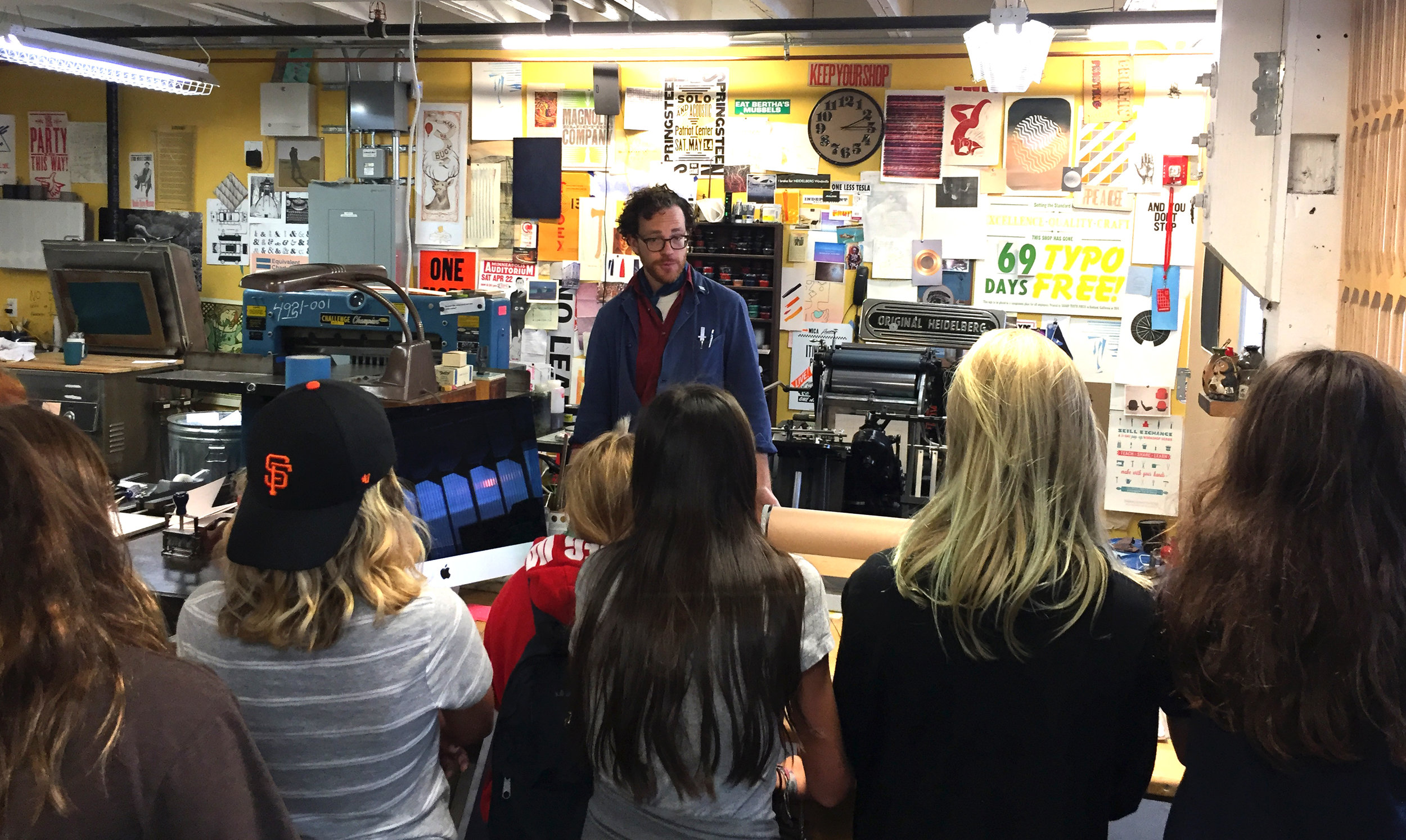 [embed]https://gfycat.com/gifs/detail/DevotedWigglyKagu[/embed]
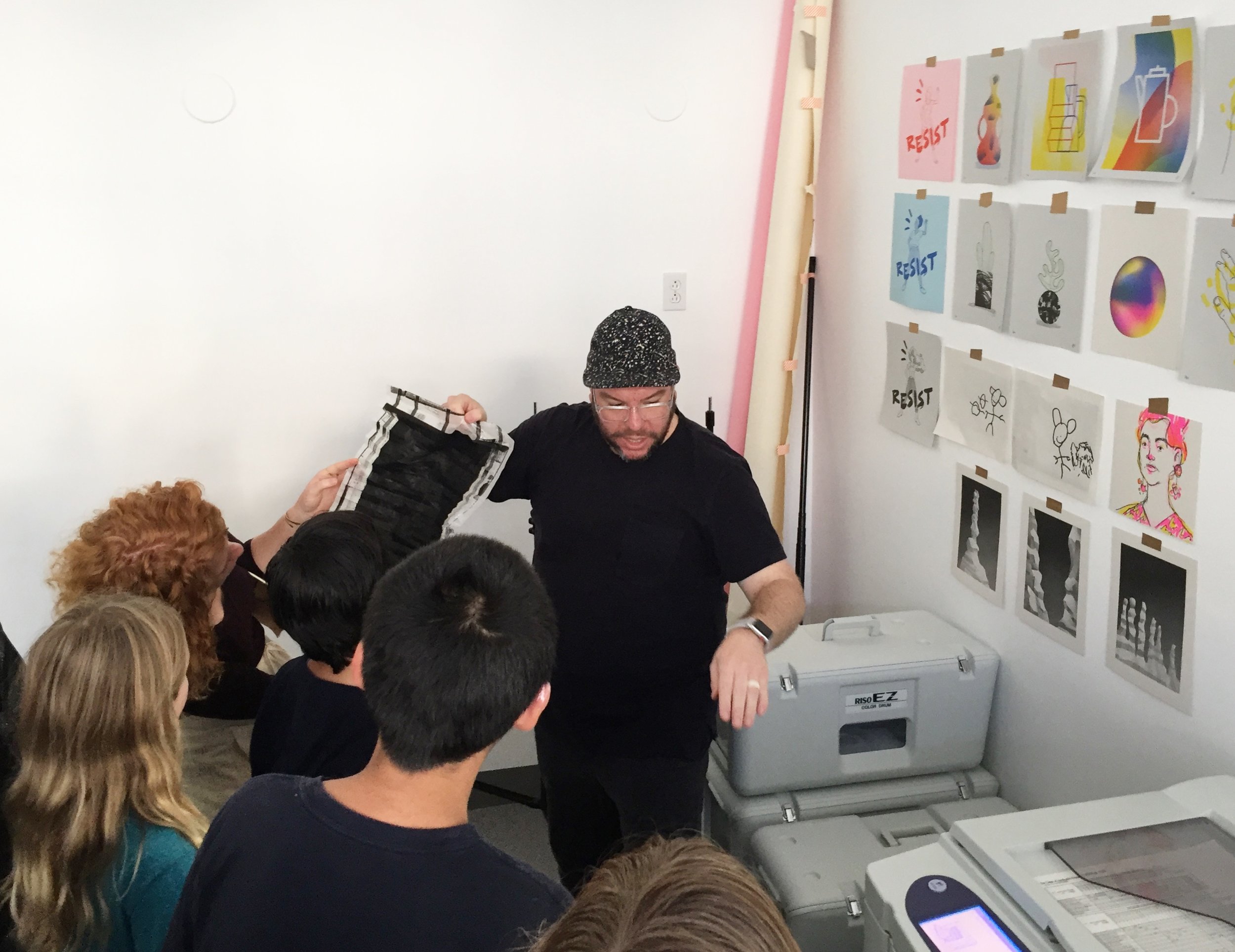 After printing our personal logos, we got to visit some design studios in our neighborhood. First we went to The Aesthetic Union, where we saw a 90-year-old printing press. Then we went to graphic designer Ryan Putnam's studio to check out the Risograph printing process he uses, combining digital and analog aspects (similar to the screenprinting process of our personal logos). Thanks to Karen and Michelangelo Capraro (Amber Band parents, and graphic designers extraordinaire) we got to get feedback from professionals on our designs, and even made plans for ways to combine our ideas into an Amber Band t-shirt design.